The Evolution of the Batman Logo Through the Ages
The answer in brief
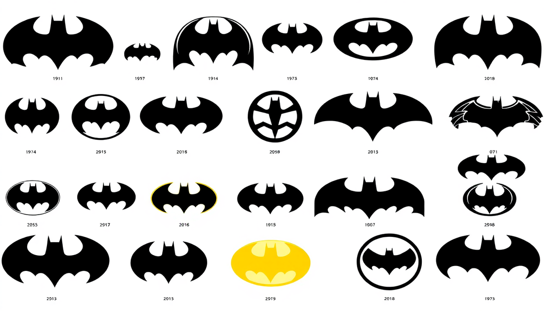
A revealing detail: in 1939, the emblem was no more than a very streamlined winged creature, black on a light background, with no defined frame and no fixed proportions. The following decades refined its outline, hardened its wings, added color and a shadowy background. The decisive turning point remains the move from paper to projected light: the insignia left the cover ornament behind and became a genuine narrative device.
Contents
There are few symbols able to do entirely without words. The bitten apple, the Olympic rings, the yellow and black bat. The last of these belongs to a fictional character, and yet it has won a recognition that plenty of global brands envy. Projected into the Gotham sky, printed on a T-shirt, stamped on a belt buckle, the Batman logo works like a signature: one second is enough for it to evoke the night, justice and the Dark Knight. But this design we believe to be unchanging has never stopped shifting since 1939. Tracing the evolution of the Batman logo means following, in filigree, the history of the character himself, and understanding why this symbol remains, even today, one of the most powerful in popular culture.
🦇 The origins of the Batman logo
It all began in 1939, when the character of Batman made his debut in the pages of Detective Comics #27. At the time, the logo was only a simple drawing of a black bat with spread wings, set without artifice on a light background. This pared-down, minimalist rendering matched the dark and mysterious image of the vigilante, who had only just appeared in the DC universe. Nothing was settled yet: not the proportions of the wings, not the presence of a cartouche, not even the idea that an emblem could become as central as the hero's face.
Very quickly, though, this drawing took on a strong symbolic value, becoming the emblem of the masked vigilante far beyond its simple graphic function. Over the decades it has been reused, adapted and reinterpreted in a thousand ways, fitting itself to every era and every new depiction of Batman. To place this founding moment within the character's broad chronology, our guide to the ideal chronological order for discovering the DC Comics universe puts Detective Comics #27 exactly where it belongs: the starting point of an entire mythology, whose threads are then unwound by the story of Bruce Wayne and the complete universe of Gotham characters .
The key point
In 1939, in Detective Comics #27, the logo is nothing more than a black bat with spread wings on a light background. Nothing is settled yet, but this drawing quickly becomes the emblem of the masked vigilante.
🎭 The evolution of the logo in the 1940s and 1950s
Through the 1940s and 1950s, the Batman logo went through subtle changes, but always with respect for the original aesthetic. Finer details appear, such as wings that become more angular and more worked, giving the silhouette a new edginess. The symbol is also shown in color more and more often, with a dark background that makes the bat stand out and heightens the character's nocturnal quality.
This is the period when the logo stops being a simple cover ornament and becomes a landmark. Readers learn to look for it, to recognize it from one newsstand to the next. It is also the era when the idea of the Bat-signal settles permanently into the collective imagination: no longer just a drawing on paper, but a projected light, a call. This shift from the printed logo to the projected logo is one of the most important in the whole history of the symbol, because it turns an emblem into a storytelling device. Today that visual legacy is everywhere, from the Batman posters that hang in fans' bedrooms to the decorative objects that replay the projection of the signal on a wall.
Worth remembering
In the 1940s and 1950s, the wings become more angular and the symbol moves to color on a dark background. Above all, the idea of the Bat-signal turns the printed logo into projected light, and so into a storytelling device.
🌃 The Batman logo of the 1960s and 1970s
The 1960s mark a spectacular break. With the 1966 television series and its deliberately colorful, pop tone, the Batman logo is often set in a yellow oval cartouche against which the black bat stands out. That famous yellow oval, which became one of the most recognizable versions of the symbol, answered a simple logic: maximize legibility and visual impact on screen and on the merchandise that was multiplying at the time.
This sunny, optimistic version of the logo contrasts sharply with the character's dark origins, and that is exactly what makes it fascinating. It shows that a symbol can change emotional register without losing its identity. The bright yellow of the sixties never really went away: it still runs through a large part of the merchandising today, from the T-shirt printed with the classic symbol to everyday accessories. For anyone who wants to understand how to wear this legacy without sliding into costume, our guide to everyday Batman T-shirt looks shows that the yellow oval of the 1960s is still, sixty years later, a style argument.

⚔️ The modern Batman logo
From the 1980s and 1990s onward, the Batman logo makes a deliberate return to its roots, but with a new graphic maturity. The yellow oval gradually fades in favor of a lone bat, longer, more tapered, stripped of any cartouche. This version, popularized in particular by Tim Burton's 1989 film, imposes an elegant and menacing silhouette that fits perfectly with the dark, adult turn the character takes in the comics of the same period.
This modern logo is probably the one that has left the most lasting mark on contemporary visual culture. Its elongated, almost abstract shape works just as well blown up on a poster as shrunk down on a label. It is the triumph of simplicity: fewer details, more presence. Cinema plays a decisive role in that enshrinement, and our overview of Batman movie posters from Burton to Reeves shows just how far each director has redrawn the symbol in his own way. That cinematic lineage is set out in detail in the complete chronology of the Batman films, where each era imposes its own version of the emblem.
The key point
From the 1980s and 1990s onward, the yellow oval fades in favor of a lone bat, longer and more tapered, popularized in particular by Tim Burton's 1989 film. Fewer details, more presence.
🃏 The contemporary Batman logo
Today the Batman logo lives several lives at once. The Arkham video games imposed a textured, battered, almost organic version that fits a Gotham grimier and more realistic than ever — a universe that our guide to the best Batman video games explores in detail. Recent films, for their part, offer rawer emblems, sometimes cobbled together from a weapon holster, as if to remind us that Batman is still a man and not a polished brand. And in the comics, artists keep reinterpreting the symbol with every relaunch.
This multiplicity is a strength. Where other logos age badly by staying frozen, Batman's regenerates by absorbing the spirit of the times. It can be retro and pop on a vintage poster, dark and menacing on a collector's figure, or laid-back on a DC Comics T-shirt. That plasticity explains why the symbol lends itself so well to decorating: there is a version of the logo for every room and every mood, as our room-by-room Batman decoration guide sets out.

🏛️ Why this symbol speaks to us so strongly
If the Batman logo crosses the decades without ever wearing out, it is because it says something deeper than simple membership of a fandom. Wearing or displaying the bat means claiming a certain idea of justice, of discipline and of resilience — the values of an ordinary man who chose to get back up. That is also why the symbol works so well as a gift: it does not merely please, it tells the person receiving it that a part of that imaginary world has been recognized in them. Our ultimate guide to Batman merchandise for collecting and gifting extends that idea, as does our selection of premium pieces for the most demanding fans.
From the raw bat of 1939 to the pop yellow oval of the sixties, from the Burtonesque silhouette to the textured emblem of the Arkham games, the Batman logo will have been through everything without ever ceasing to be instantly recognizable. It is this constancy within change that makes it a textbook case. And that is why, whether it is a T-shirt, a mug for the morning coffee, a plush toy for the youngest, or the whole of the Batman gift collection, this simple drawing keeps turning an ordinary object into a fragment of Gotham. The symbol itself is far from finished evolving.
Worth remembering
From the raw bat of 1939 to the textured emblem of the Arkham games, the logo stays instantly recognizable. It carries an idea of justice, of discipline and of resilience, which explains its force as a gift.